Think of a high bounce rate like a quick handshake—it can be good or bad depending on the context. Bounce rate is a key metric that shows the percentage of visitors who land on your site and leave without clicking through to another page. It’s like a snapshot of first impressions.
In some cases, a high bounce rate could be positive. For instance, if a visitor finds exactly what they need on the first page, like a contact number or a specific answer, and leaves satisfied, your site has done its job efficiently.
However, more often than not, a high bounce rate signals issues like confusing navigation, slow loading times, or content that doesn’t meet the visitor’s expectations. This can lead to missed opportunities and potential revenue loss.
Understanding both sides of the bounce rate is essential. It helps you gauge whether your website effectively meets user needs or if it’s turning potential customers away. Today we’re exploring how you can manage and optimize your bounce rate, turning more visits into meaningful encounters.
1. Provide High-Quality, Relevant Content
You’ve probably clicked on a result in Google search that looks promising only to find a page of useless information, which sends you straight to the “back” button. This situation is highly frustrating for users, hence why Google considers bounce rate an important factor when judging the quality of your site.
To make sure you’re meeting the needs of searchers, ensure that you’re publishing great content – not just adding in keywords for the sake of it.
You can also improve the relevancy of your content by checking your stats to see the actual search terms that people are using when they find your site. If your existing content isn’t already addressing these search terms, edit it or add new content to meet their needs.
2. Improve Your Navigation
When a new user lands on your site, it should be immediately apparent how they can navigate to the information they’re looking for.
A clear and well-organized menu is normally the backbone of a good navigation system, and adding search functionality also helps users to find where they want to go quickly.
Make sure your menu labels are simple and make sense. Group similar items together so users can guess where to find specific information easily. You can also add breadcrumbs—these are small links at the top of the page that show users how they got to their current location. This makes moving around your site easier and helps them feel less lost.
These steps not only make your site easier to use, but also help it rank better in search results.
3. Ditch the Pop-Ups
Pop-ups are highly effective at boosting your conversion rate; however, they are also highly effective at annoying your visitors. This is especially true for badly designed pop-ups that cover the whole screen on mobile, or that are difficult to close.
If you don’t want to get rid of pop-ups entirely, it’s worth experimenting with some different options such as those that are activated only when a user scrolls to the bottom of a post or demonstrates “exit intent.”
4. Speed Up Your Site
If a user has to wait too long for the page to load, they’re likely to become frustrated and hit the back button. This is especially true for mobile users, over half of whom will leave if a page takes longer than 3 seconds to load.
There are usually several ways you can speed up your site by using caching plugins or a CDN, compressing images, minimizing HTTP requests, and considering switching web hosts.
You can also make your site faster by simplifying the code. Tools like Google’s PageSpeed Insights tell you exactly what to fix to make your site load faster. Also, make sure your hosting plan fits your site’s needs—especially how much visitor traffic you get. A slow host can make your site slow, too, and make people leave your site more often.
5. Design for Mobile Users
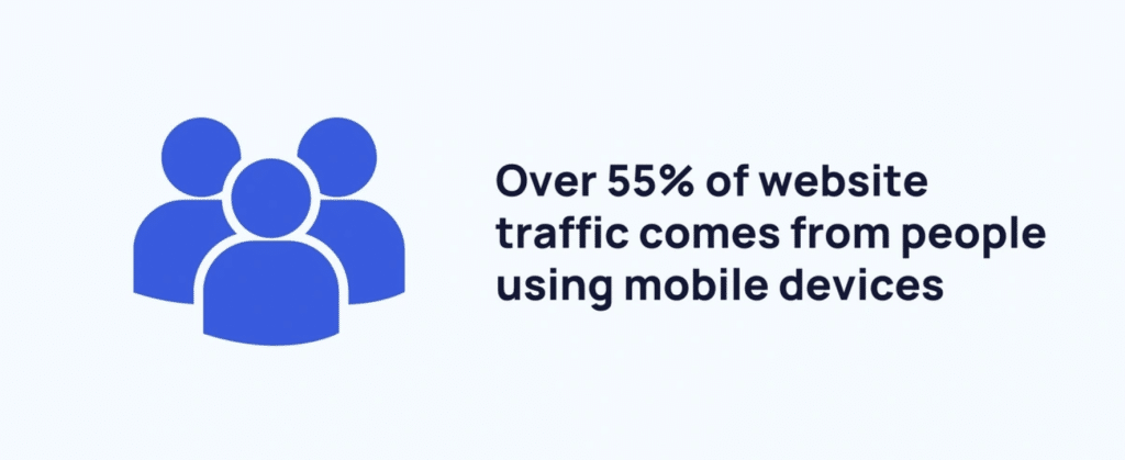
It depends on the industry you’re in, but on average over half of your web visitors will be browsing your site on a mobile device.

Image Source
If your website is hard to read and navigate on a small screen, they’re probably going to go away and find another site that meets their needs better.
Make sure your website is responsive and tested thoroughly for mobile users so that it’s attractive and easy to use.
6. Improve Content Readability
A wall of text with little white space can be very off-putting for users, who may well click away to find content that’s a little more visually appealing.
Make your content more attractive and easy to read by breaking it up into short paragraphs with plenty of sub-headings, bullet points, highlighted sections, and images. You should also use a relatively large font size to make sure your text is easy to read.
Also, consider your writing style and if writing in a simpler language with a more casual style will make it more appealing and readable.
7. Use Eye-catching CTAs
What action do you want the user to take when they’ve finished reading the content on the page they land on? Make sure it’s crystal clear with an enticing CTA that will encourage users to click on it and find out more about what you have to offer.
To make your CTA stand out, focus on color and size that catch the eye but still fit with your website’s design. Placement is also key; put your CTA where visitors naturally look, like near the end of a post or at the center of the page.
Video Source
We also like to use words that create a sense of need or excitement, like “Grab Yours Now” or “Don’t Miss Out,” which can push visitors to act right away. Also, think about personalizing CTAs for different visitors. For example, a new visitor might see a “Discover More” button, while someone who has visited several times could see a “Get This Deal Now” button.
8. Update Old Posts
If you have content that’s a few years old but still ranking well in Google, make sure it’s still useful and appealing to users by updating it regularly.
It can be very off-putting to click through to a search result and see that the information is out of date, but if you update your content periodically and add the date it was last updated to the top of your post, this shows both the user and Google that you’re on the ball.
9. Fix Broken Links
Broken links result in a poor user experience that will cause your bounce rate to go up. Regularly updating and checking your links should be part of your routine website maintenance.
Remember, every broken link can potentially lead to lost opportunities to engage a visitor or make a sale. You can use tools like Google Search Console to monitor for broken links and errors so you can fix them promptly.
Moreover, making sure all links lead to the intended destinations boosts your site’s credibility and keeps your content accessible. Consider scheduling monthly reviews of your website’s links as a best practice to maintain a healthy, user-friendly site.
Lastly, implement a helpful 404 error page to help users find the information they were looking for – a search box is always a helpful addition.
10. Add More Internal Links
One of the easiest ways to keep people on your site for longer is to direct them to other information that might be helpful or interesting for them without them having to go hunting for this.
You can do this by adding contextual links to other pages in your content and listing other related content at the end of each blog post; there are plugins that can do this for you automatically.
This improves the user experience and helps to keep them on your site for longer, so keep an eye out for internal linking opportunities wherever you can.
11. User Experience Personalization
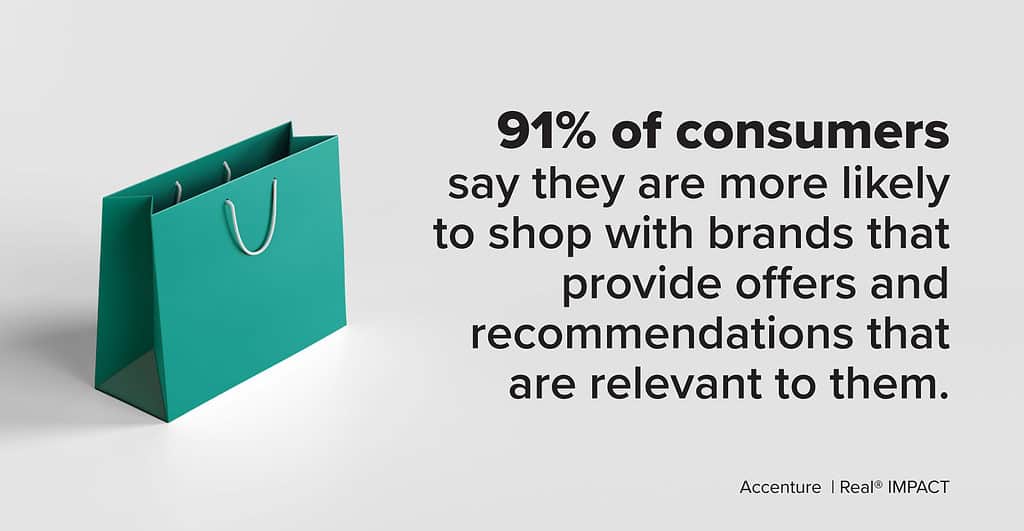
Personalizing your website’s user experience can dramatically cut down your bounce rate. It’s not just about making visitors feel special; it’s about delivering the content they find valuable right off the bat. According to recent data, 91% of consumers are more likely to shop with brands that recognize, remember, and provide relevant offers and recommendations.

Image Source
Here’s how it works: By analyzing user data, you can tailor your website dynamically to fit different visitors’ needs. For example, a new visitor might get a pop-up inviting them to check out an introductory blog post. In contrast, a returning visitor could see suggestions for advanced tutorials or exclusive offers that align with their previous interactions.
When visitors find what they need faster, they stick around longer. It’s that simple. Personalization makes visitors feel understood and valued, which encourages them to engage more with your site.
Starting out is straightforward. Use tools to track visitor behavior, then segment your audience based on their actions and preferences. Adjust your site’s content accordingly to make every visit feel personalized. Whether it’s changing the featured products, customizing call-to-actions, or adapting content recommendations, these tweaks make a significant difference.
Reduce Your Bounce Rate Today with MIG
Making your website a place where visitors want to stay is key to reducing your bounce rate. Keep checking what works and what doesn’t, and tweak things to keep your visitors happy. Stick with these tips, and you’ll see more visitors sticking around instead of bouncing away.
Ready to reduce your bounce rate? The first step is to create high quality content that engages your audience. Get started today by checking out our weekly blog content service, or schedule a free consultation now to learn more!


